Conversion-Centred Design: Why Pretty Websites Stay Quiet

9 min read
In Short: Conversion-centred design means building every page around one clear action, so visitors know exactly what to do next. Get it right and an existing website can turn more of the same traffic into enquiries, with no rebuild required. Here is how to apply it to a site you already have.

Table of Contents

A website can look superb and still bring in almost nothing. We see it often. A business spends months perfecting the colours, the photography and the wording on the homepage, then quietly wonders why the contact form stays silent.

The gap is rarely the design itself. It is what the design is built around. Conversion-centred design fixes that by shaping every page around one thing you want the visitor to do, so the path from landing to enquiry is obvious rather than left to chance.

Since 2015 we have helped over 150 businesses turn good-looking sites into ones that actually generate leads, usually without a full rebuild. This guide walks through the levers that move the needle most, and how to apply conversion-centred design to a site you already have. If you would rather we just looked at yours and told you what is costing you enquiries, a free website audit is the quickest way to find out.

What conversion-centred design is for

Most web design starts with how a site looks. Conversion-centred design starts with what you want it to achieve, then works backwards. Every layout choice, every heading and every button is judged on one question: does this make it easier for the right visitor to take the next step?

That step is your conversion. It might be a form submission, a phone call, a quote request or a sale. The label matters less than the discipline behind it. When a page is built around a single, clear outcome, visitors spend less effort working out what to do, and more of them follow through.

It helps to picture the person on the other side of the screen. A visitor arrives with a question and limited patience. If the page answers it quickly and points to one sensible next move, you keep them. If it buries the answer under clever animations, three competing menus and a wall of text, you lose them, however lovely it looks.

This is also why conversion-centred design pairs so well with our improve-before-you-rebuild approach. You rarely need to throw the site away. More often the bones are fine and the structure just needs sharpening so each page earns its place. A focused website tune-up can lift results from the traffic you already have, without the cost and disruption of starting again.

The ideas that follow are the levers we reach for most. None of them needs a designer’s eye. They need honesty about what each page is for, and the discipline to cut anything that gets in the way.

Give every page one job

The fastest way to weaken a page is to ask it to do everything. Sign up to the newsletter, follow us on social, read the blog, download the brochure, book a call, buy now. Each extra option splits the visitor’s attention and lowers the odds they do any of them.

Conversion-centred design takes the opposite view. Decide the one action that matters most on each page, then make that action the obvious hero. Everything else either supports it or steps aside.

Picture a tradesperson’s services page with five competing buttons above the fold. A visitor who is ready to enquire has to stop and choose, and hesitation kills momentum. Strip it back to a single clear call to action, repeated naturally as the visitor scrolls, and the same page suddenly does its job.

This does not mean deleting everything else. Secondary links can live in the footer or further down the page for the small number of people who want them. The point is hierarchy. One primary action, given room to breathe, beats six options fighting for the same attention.

It is worth checking each key page with a blunt question. If a stranger landed here for ten seconds, would they know exactly what to do next? If the answer is no, or if you find yourself listing three or four things, the page is trying to do too much.

Lead generation pages live or die on this discipline, which is why our lead generation websites are built around one job per page from the start. For a closer look at the parts that matter, our guide to the essential components of a lead generation website breaks them down.

Lead with the benefit, not the feature

People do not buy features. They buy what the feature does for them. Yet most websites still open by talking about the business: how long it has been going, how passionate the team is, how many services it offers. The visitor is left to work out what any of it means for them.

Conversion-centred design flips the order. Lead with the outcome the visitor wants, then explain how you deliver it. Instead of “we offer managed hosting”, try “you keep a fast, secure site that is always online, without ever touching a server”. Same fact, but now it speaks to a worry the reader actually has.

This starts with your value proposition, the promise a visitor reads in the first few seconds that tells them they are in the right place. Get specific. Who is it for, what do they get, and why you rather than the next tab they have open. A vague headline like “welcome to our website” wastes the most valuable space on the page.

Get more from the visitors you already have

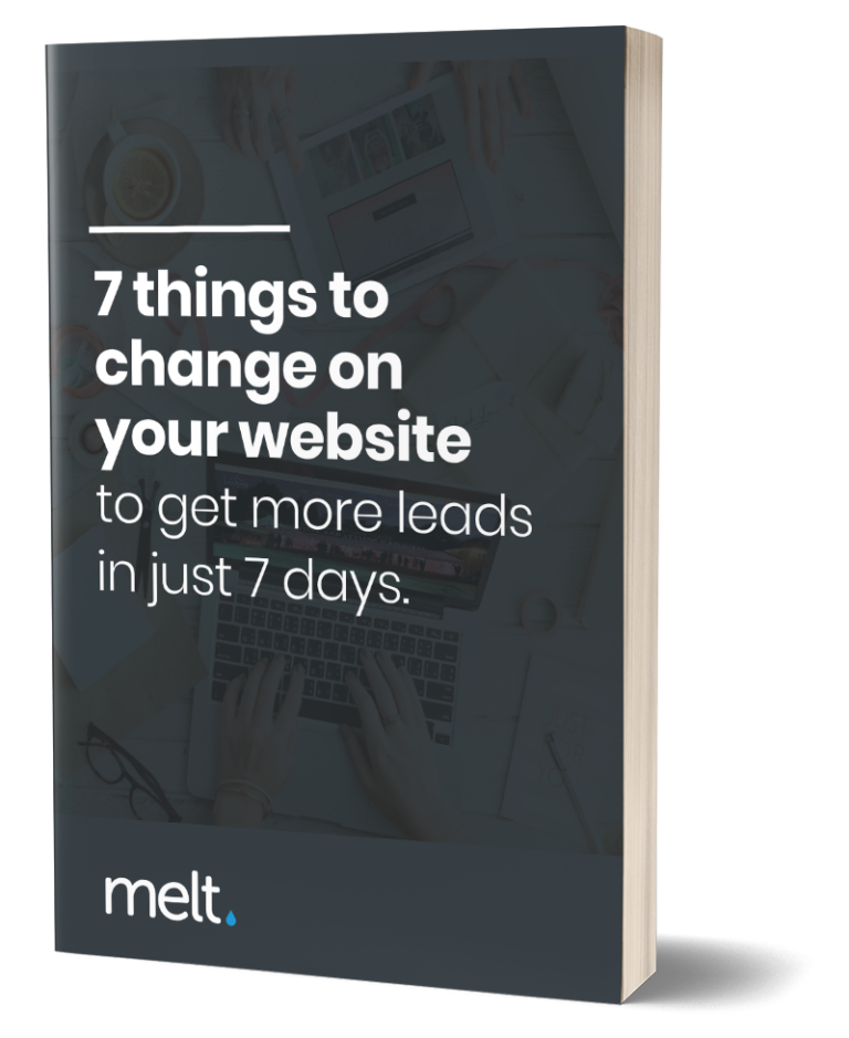
Seven quick wins you can make this week to turn more of them into enquiries.

It matters even more for business-to-business sites, where buyers may not know your industry as well as you do. Spell out the benefit plainly rather than assuming they will connect the dots. The clearer you make the value, the less work the visitor has to do, and the more likely they are to stay.

A quick test. Read your homepage headline and the first line beneath it, then ask whether they describe what the visitor gains or what you sell. If it is the latter, rewrite it around them. Our rundown of the features every small business website needs for conversion shows how this benefit-led thinking runs through every section, not just the headline.

Earn trust before you ask for the sale

A visitor can love what you offer and still hesitate, because they do not yet know whether to believe you. Trust is the quiet thing standing between interest and action, and conversion-centred design treats it as something to build, not an afterthought.

The good news is you usually have the raw material already. Genuine reviews, named testimonials, recognisable client logos, a short case study with a real result, an accreditation or a years-in-business figure. Each one answers the unspoken question, can I trust these people, before the visitor has to ask it.

Placement matters as much as having them. A testimonial sitting alone on a hidden reviews page does little. The same testimonial next to your main call to action, right where the visitor is deciding, does real work. Put your proof where the decision happens.

Be honest with it too. A handful of specific, believable reviews beats a wall of five-star praise that reads as if you wrote it yourself. Real names, real businesses and real outcomes carry weight precisely because they can be checked. Overclaiming has the opposite effect. It makes a careful buyer more suspicious, not less.

If you are short on social proof, that tells you where to focus next. Ask recent happy customers for a line or two while the work is fresh in their mind, and add it to the pages where buying decisions get made. Even two or three honest testimonials, placed well, can shift how a page performs.

Make the next step obvious, then test it

You can do everything else right and still lose people at the last step if the call to action is weak, hidden or vague. The button is where intent becomes action, so it deserves real attention.

Make it easy to find and easy to understand. One clear, well-placed call to action that says exactly what happens next, “get my free quote” rather than “submit”, will always beat a timid link buried at the foot of the page. Use the visitor’s language, not yours, and repeat the action naturally as the page gets longer so it is always within reach.

There is an honest version of urgency, too. You do not need fake countdown timers or invented scarcity, which tend to erode trust with the very buyers you want. But a genuine reason to act now, a limited number of project slots, a price that rises next quarter, a real deadline, gives a ready visitor permission to move rather than drift away to think about it.

Speed quietly shapes all of this. A visitor who is ready to act will still leave if the page makes them wait, and the effect is measurable. Google’s own guidance for business decision makers notes that faster, more responsive pages tend to lift engagement and conversions, while slow ones cost you enquiries before the design gets a chance to work. A page can be beautifully laid out and still lose money if it loads like treacle.

Finally, do not assume, check. Watch how real visitors behave, see where they hesitate or drop off, and adjust. A small wording change on a button or a moved form can make a surprising difference. Treat your key pages as something you refine with evidence, not a thing you finish once and never touch. The site that converts best is almost always the one its owner kept improving.

Turn your design into enquiries

Conversion-centred design is not about making a site prettier. It is about making it work harder, by building each page around one clear action, leading with what the visitor gains, proving you can be trusted and removing every bit of friction between them and the next step. Do that, and the traffic you already have starts converting better, often without spending a penny more on getting people to the site.

The encouraging part is that none of it requires starting over. Most sites are closer than their owners think, and a few focused changes to the pages that matter most can shift the numbers quickly.

If you want a simple place to begin, try this:

  1. Pick your three most important pages and decide the single action each one is for.
  2. Rewrite the main headline of each to lead with the visitor’s benefit, not your business.
  3. Add a clear, specific call to action and a piece of genuine proof right beside it.
  4. Check how each page loads on a phone, and fix anything slow or fiddly.

If you would rather have an expert eye on it, we are happy to help. Start with a free website audit and we will tell you honestly what to fix first, and what to leave well alone.

Related Posts
Man viewing a Vellanites AI Overview dashboard displaying data visualisations and analytics on a monitor in a tech office.

By Matt Eldridge, Managing Director · Published 18th August 2026 AI Overviews now sit at the top of Google, answering questions before anyone scrolls. If...

Hands shown; one is typing on a laptop with a small business website open, and the other is writing "Form LLC" on a brown paper. Two blue vases and stackable cardboard boxes are visible on the desk.

By Matt Eldridge, Managing Director · Updated 13th June 2026 Importance of a small business website Your company website is crucial for attracting and converting...

Web accessibility helps your site reach more people, rank better and stay on the right side of the law
Web accessibility means building your website so everyone can use it, including people with visual, hearing, mobility or cognitive needs. Get it right, and you...
Want more leads by the end of the week?
Get seven quick wins you can make this week to turn more of your existing visitors into enquiries. No redesign needed, just smart changes that make your site work harder.

"*" indicates required fields

This field is for validation purposes and should be left unchanged.
We'll email it straight over. No spam, and you can unsubscribe any time.
Your website should be winning you work
Get your free web audit Worth £295

If it isn’t pulling its weight, we’ll show you why. One of our experts will review your site for free and send you a plain report, with the changes that matter most listed in order, so you know where to start.